Design gets easier when you don’t skip ahead

Why following the order of UX steps pays off at every stage
When a project kicks off, it’s tempting to jump straight to the interesting stuff. Wireframes, prototypes, design. Anything that looks like progress.
But better products come from following a clear process. Each stage sets the foundation for the next. You can’t write meaningful user stories without understanding the journey. You can’t map a journey if you don’t know who your user is. And testing a prototype only helps if it’s based on the right problems in the first place.
Each step sets up the next. Skip one, and the decisions that follow aren’t just harder. They’re based on assumptions. Without the right input, choices around features, content or design end up driven by opinion, not evidence.
This isn’t about being rigid. It’s about removing guesswork so every decision is easier to make and easier to explain.
Start with the people, not the interface
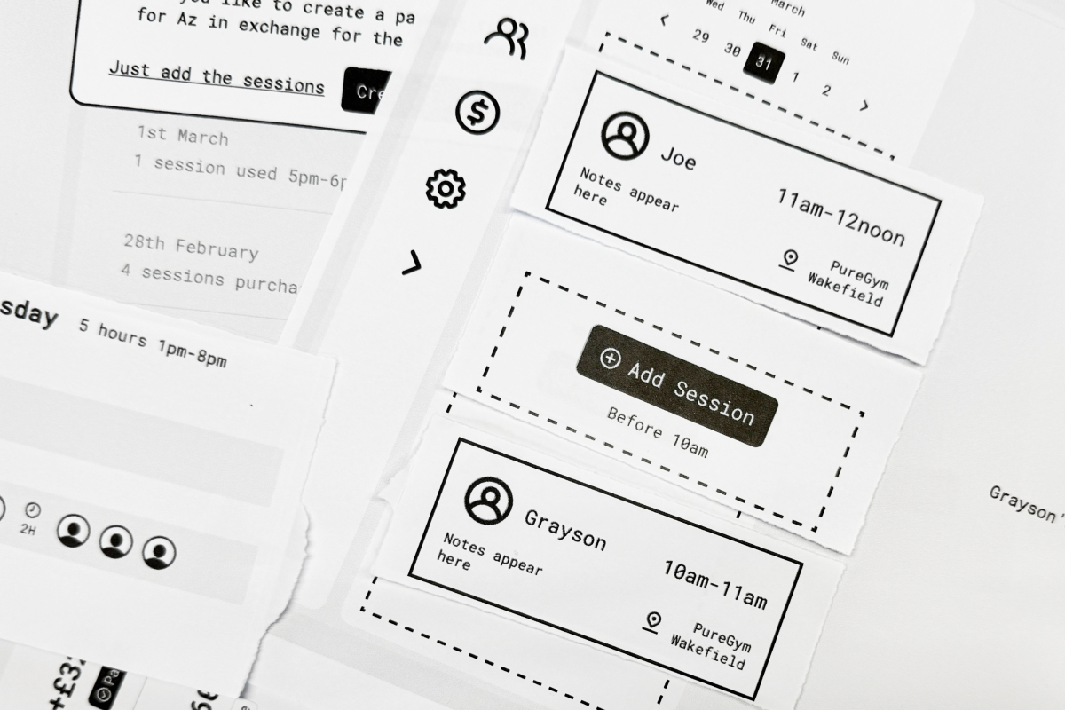
We recently worked on PT Portal, a SaaS product built for freelance and online personal trainers. It lets PTs manage session payments, track how many sessions each client has used, and plan their week without a mess of tools or spreadsheets.
At the start, there was no product. Just an idea. So we began with research.
We spoke to trainers about how they actually work. What a normal week looks like, how they charge clients, what admin they do, and what’s annoying. This surfaced the core problems we needed to solve.
From there, we pulled together a set of proto-personas to keep everyone aligned. They weren’t detailed profiles, just clear snapshots of the different ways PTs work. Some run back-to-back sessions on the gym floor. Some split their time between in-person training and online coaching. Others manage larger client numbers fully online.
Different contexts, different pressures, but the same core needs. Those personas shaped every decision that followed.
Map the journey before you write the story
Once we understood the people, we looked at what they were trying to do: setting up a client, taking a payment, tracking usage, rescheduling. We mapped those journeys and looked for friction.
This is where the product started to come into focus. We saw what needed to be visible, what needed to be automatic, and what just needed to stay out of the way.
It also made it clear how the product should be organised. The structure needed to follow their tasks, not the data. Labels and navigation had to use their language, not ours.
From there, writing user stories became easy. Each one was grounded in a task we had already seen:
- As a PT, I want to know when a client has used up their sessions, so I don’t have to track it manually.
- As a client, I want to see how many sessions I have left, so I know what I’ve paid for.
Good user stories don’t appear from nowhere. They come from knowing who your users are and what they’re trying to do.
Prototyping becomes focused, not speculative
With solid stories and journeys, we moved into wireframes. We weren’t inventing layouts from scratch. We were solving specific problems in known contexts.
We tested our early flows with real PTs using guerrilla methods. Nothing fancy. Just real people doing real tasks, and telling us where they got stuck.
Because the thinking had already been done, the feedback was useful. We weren’t undoing work. We were tightening it.
This isn’t specific to this project
We follow the same sequence on every project, whether we’re designing a publishing platform, an internal tool or a public-facing site.
When you take the steps in order, each one does more for you. Research unlocks better personas. Personas make journey mapping easier. Journeys lead to tighter stories. Stories lead to sharper designs. Testing becomes meaningful.
The work gets better. And it gets easier. You just have to not skip ahead.
Case study
