Revamping Data City's Digital Identity: A Consistent, User-Friendly Experience
Transforming Data City's digital platforms with a comprehensive UI styleguide for a consistent, polished, and user-centric brand experience.

The Problem
Data City, a leading provider of real-time data on the UK's emerging economy, had a visual style that lacked consistency across its various platforms.
The marketing website, while functional, lacked the polish and attention to detail that reflected the quality of their services. Usability issues such as difficult-to-scan typography, inconsistent headings, and poor responsiveness were prevalent. The absence of a centralised style guide and user personas further complicated the situation.
- Inconsistent UI across platforms
- Slow page speed
- No centralised style reference
The Process
Understanding Data City's need for quick results, we proposed a strategy that would allow them to incrementally build a comprehensive styleguide while also delivering immediate improvements to their website performance and user interface.
We started by addressing the most pressing issues on their marketing website, which served as a catalyst for broader stylistic improvements. Simultaneously, we conducted workshops to establish user personas and empathy maps, which informed our design decisions and ensured that the improvements we made were aligned with the needs and expectations of their customers.
The Solution
- Cross-platform styleguide
- Page load < 1s
- 50% page speed increase
The Solution
Faced with a series of complex moving parts and challenges, we simplified the delivery into a series of carefully planned steps.
Initially, we focused on enhancing the website's performance by optimising the delivery of JavaScript, CSS, and assets, introducing improved caching, and fixing inaccessible navigation on mobile devices. This saw a 50% increase in page speed and page loads of less than one second.
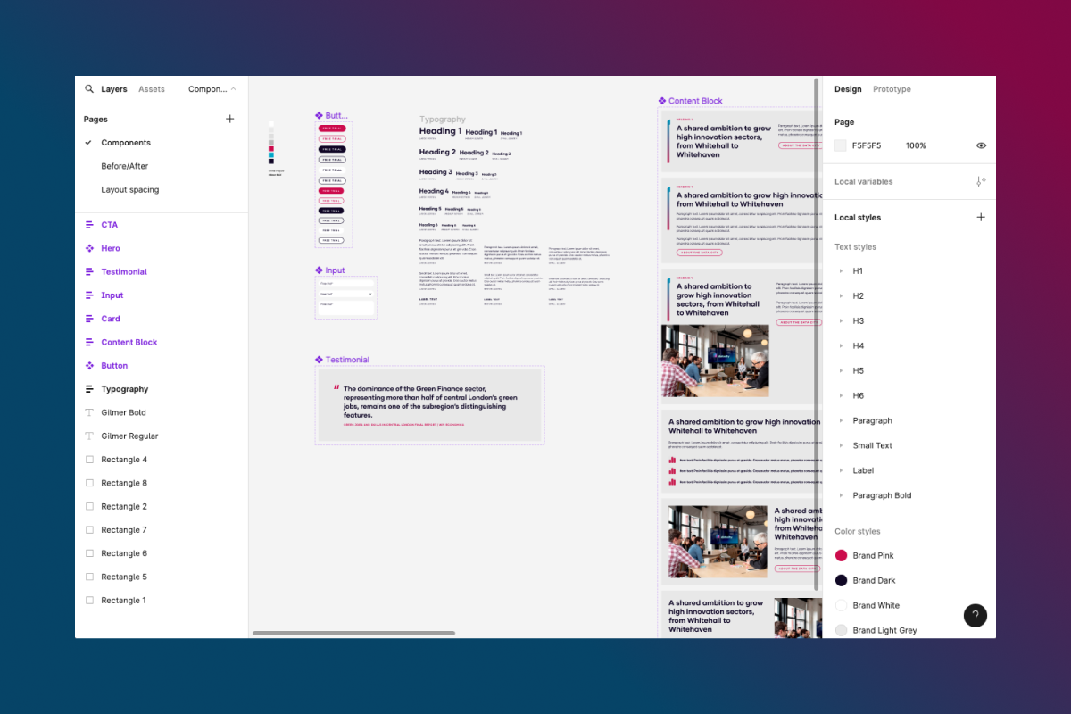
Next, we developed an initial style guide using Figma. This guide addressed key elements such as typography, button and input styling, page skeleton, and key page builder components, ensuring a consistent visual language across all platforms.
Following the creation of the style guide, we implemented the new design onto the front-end of the marketing site. Simultaneously, Data City's internal development team translated the UI updates and style guide into their data platform, beginning the move towards a consistent user experience across all touchpoints.
Finally, we worked with stakeholders to document their audience. We conducted a persona identification and empathy mapping session, which informed the user experience of the highest performing and converting section of the site and associated reports.
This step-by-step approach allowed Data City to see rapid improvements while continuing their business as usual. The result was a polished, consistent, and user-friendly digital presence that reflects the quality of Data City's services.

It’s been great working with hrpr. Ross and Dan know their stuff and are super easy to work with. They got to work optimising our website and within a few weeks it was noticeable faster and easier to use. We’re already planning more projects with hrpr in mind.