The value in using sketches for lo-fi wireframing

A few weeks ago I was scrolling through twitter X and stumbled upon this thread by Alex Socoloff discussing the value of lo-fi wireframes.
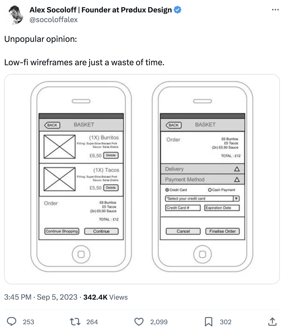
Alex’s initial argument, endorsed by many of the commenters on the thread, is that lo-fi wireframes are just a waste of time. I suppose the reason I paused scrolling, and clicked into the thread was because it jarred with something I’d experienced that week. I’d actually found that lo-fi wires had actually saved me time.
Over the previous few months I’d worked on a couple of UX projects for web applications and at the time it felt logical to step straight into Figma with a UI toolkit and start shaping screens. We’d already been through a rigorous discovery process and had a solid set of user journeys and stories to work from. However, starting on a new project for PT Portal, armed with my user stories and key feature set, something drew me towards ditching the mouse and picking up my sketchbook and pen.
What I experienced, by using a pen and paper compared to working on-screen, was a much greater feeling of freedom. Rather than being bound by a pre-configured arsenal of assets and components, I had the completely unlimited freedom to map out anything my mind wanted to explore.
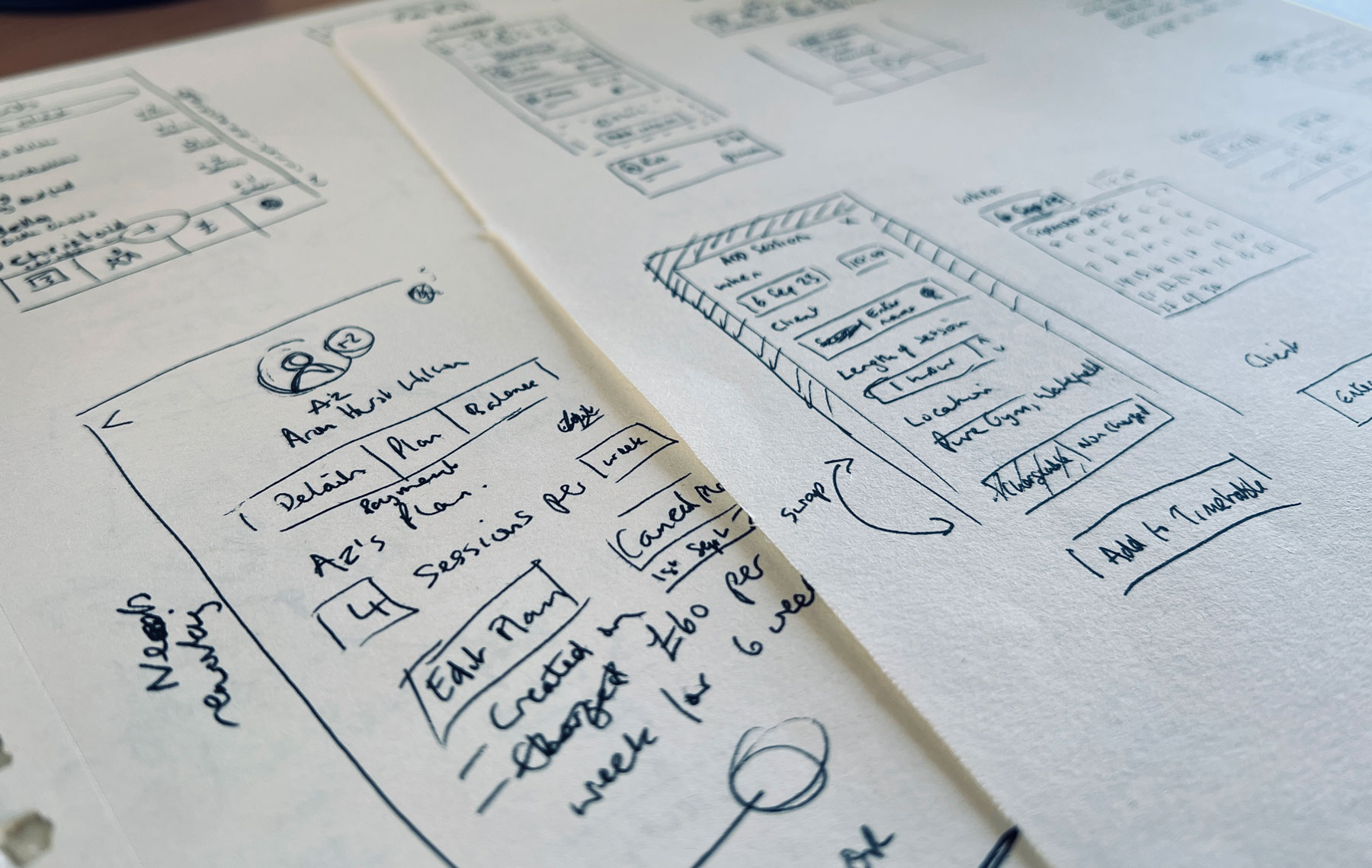
What I lost in neatly aligned icons and buttons snapping to a grid, I gained in the ability to very quickly explore layouts, annotate thoughts and more often than not, scrap them, and iterate again. Ok, the boundary lines of my layout blocks may have become wavier and looser with each iteration, but that’s not important. The key was I was allowing my mind to explore possible user journeys and interactions way faster than I could if I was doing the same on screen.
The sense of freedom I experienced and the creativity of the solutions generated during those sessions definitely reinforced to me that my first port of call for any UI design should always be pen and paper.
Perhaps it's a subjective thing, maybe others find designing on screen just as fast, fluid and creative as I do on paper, but for me a screen and a UI toolkit feel too restrictive, the inclination to make things align and typography hierarchies work too strong, that it distracts me from quickly exploring all potential solutions.
I see sketching as a short but crucial first step, an opportunity to thrash out rough ideas and hopefully hit that ‘Eureka’ moment where a user’s journey is simplified to the most natural and intuitive route. So, for now, I’ll agree to disagree with a number of commenters on Alex’s post and stick to keeping my pen and paper close by.