Gaining Rapid Insights with Guerrilla UX Testing

We’re huge advocates of the importance of user testing.
After 20+ years of designing and developing digital products, we know that one of the worst things you can do is to assume users will interact with apps or sites in the same way you would. Every user test I’ve witnessed has provided some new form of insight, yet this crucial step is frequently underestimated or disregarded.
There are varying degrees of user-testing, and I appreciate that some of the more in-depth approaches can be cost-prohibitive for clients, but before you write off testing as a luxury afforded only to the big brands with mega budgets, let me introduce you to Guerrilla UX testing - a fast, affordable mode of usability testing that gives you instant insights.
Guerrilla?
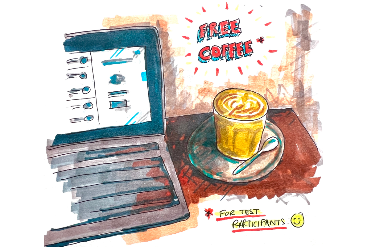
In essence, guerrilla testing involves engaging with people in coffee shops or other public settings to gather feedback on your prototype. This method is cost-effective and straightforward, offering valuable insights from real users.
The primary objective of guerrilla testing is swift error identification and resolution. This type of usability testing offers several advantages:
- Cost-Effective Setup: No need for expensive recording equipment, testing labs, travel and minimal admin
- Ease of Recruiting: The focus is on testing with available individuals, without limiting yourself to a specific demographic.
- Concise: Testing sessions are brief, around 10-15 minutes and provide valuable insights in just a couple of hours.
It’s so good, so useful, we use it on our own projects.
Testing a SaaS prototype using the Guerrilla Method
I’ve recently been working on the key journey wireframes for PT Portal. The SaaS product enables Personal Trainers to manage their weekly timetable, clients, invoices and payments all under one roof. The initial concept was borne from a round of discovery interviews with Personal Trainers, establishing how they manage their businesses and inefficiencies they experience day to day.
After documenting the initial feature set and associated wireframes, we now needed to test whether decisions we’d made when working up the UI design resulted in an easy to use system. Primarily, our aim was to eliminate the need for detailed guides during a user's initial registration, so we created a lofi prototype in Figma that allowed users to navigate through the key journeys and complete our initial onboarding objectives.
Setting up the test
One of the keys to Guerrilla testing is to keep things short, not only because you’re asking strangers for their time, but also because you need to observe them during the test and quickly document the results shortly after.
The tasks
I opted for tasks that covered all the key features and addressed some questions we had over how well the onboarding process helped users to quickly get up and running:
- Task 1 - Register for PT Portal and add an appointment to your calendar
- Task 2 - Create a new client, add 4 PT sessions to their account and charge £120 for the sessions
- Task 3 - Change the colour of the app to your liking
- Task 4 - Logout
Documenting the tests
I wanted to ensure I was able to watch every participants’ scroll, click, and pause to help me spot areas where they were struggling, or to prompt them with a quick “what are you thinking right now?”. This meant I couldn’t be taking detailed notes at the same time. I didn’t want the barrier of cumbersome kit and consent forms in order to record participants, instead I opted for a spreadsheet inspired by this article that allowed me to quickly score the completion of each task using the following scoring:
- 3: User can complete task quickly and with no trouble
- 2: User can perform task but has some struggles
- 1: User can't perform task

This approach means I could gather a mixture of qualitative and quantitative data about each test.
Testing
Round One
Armed with my lo-fi prototype, my scoresheet and the offer of a coffee or my overwhelming and eternal gratitude by way of compensation, I set about the streets of Wakefield to gather some rapid feedback. For the first round I primarily focussed on gyms as the location for finding participants and the initial results were interesting.
Registration and logout was easy for all participants, but 57% clicked around the system once registering, taking them away from the on-boarding path we’d designed. This meant they then had to familiarise themselves with the primary navigation in order to complete the timetable task.
Similar observations were made when adding a client, 71% clicked around in order to find the ‘Client’ area, but once found completed the remaining part of the task without issue.
When completing the app colour task, 29% completed it without any struggles, whilst 71% required multiple clicks to arrive at the correct Settings page. Once found, the actual action of changing colours was completed easily.
Overall, all the users could complete the tasks provided, but there were clearly areas for improvement.
Iterative Design and Immediate Fixes
Based on these results, we made some small refinements to the prototype. These changes weren’t guaranteed to solve the problem, but instead were an informed adjustment that we could test to see if it improved the participant’s ability to complete the tasks.
The adjustments based on round one feedback were:
- Order of main navigation items. Immediately after registering, users are directed to the Timetable area. We observed that their assumption was that Timetable would therefore be the first item in the primary navigation. As a result we switched the ordering of the nav items to reflect this.
- Expanded navigation. Our initial prototype had the navigation collapsed, so it was displaying icons only. Users clicked around trying to establish what the icons meant, so we set the default state of the navigation expanded with navigation item labels displayed for all newly registered users.
- Audience appropriate colours. The original prototype had a muted set of colours available for customisation. This caused some users to pause or voice frustration that there wasn’t anything suitable to them. As a result we adjusted the options to be more inline with stereotypical gym/personal trainer brand colours.
- Location of colour settings. Once onboarded, the customisation system colours were located in Settings > Appearance. In the first iteration this was overlooked by 71% of participants, who were looking in Settings > Business first. We moved this to Settings > Business.
Round Two
For the second round I took the revised prototype to our local coffee shop and spent a few hours testing with a new set of users. There were some notable improvements, but some areas that still require adjustments and further testing.
The completion rate for adding an appointment to the timetable without any struggles increased from 43% to 66%. The reordering of the primary navigation resulted in an increase from 29% to 67% of users being able to create a client without any issue.
Relocating app colour customisation to Settings > Business actually saw a decline from 29% to 16% for those users who could complete the tasks without issue, and 7% gave up on the task, therefore will be subject to further testing.
Interestingly the completion rate for logging out also decreased from the previous 100% score. No changes were made to this between rounds, so this highlights another area for further testing. In the post-test discussions some participants did volunteer potential solutions, outlining where they expected to look to logout.;
Improving usability, quickly
The insights gained from the tests really demonstrated the benefits of introducing some form of user-testing into the design process. Small, but crucial adjustments that could easily have been overlooked improved the experience for actual users.
No assumptions, no designer-knows-best, by carrying out rapid Guerrilla user testing we improved the usability of the product within a few days.
It’s at the heart of what we do at hrpr - we want to create solutions that work, and our user-centric approach is designed to deliver benefits to your business and your audience.
Do you have a website or app that you feel is underperforming? Want to gain useful insights into how your customers interact with your products? Let’s talk.